
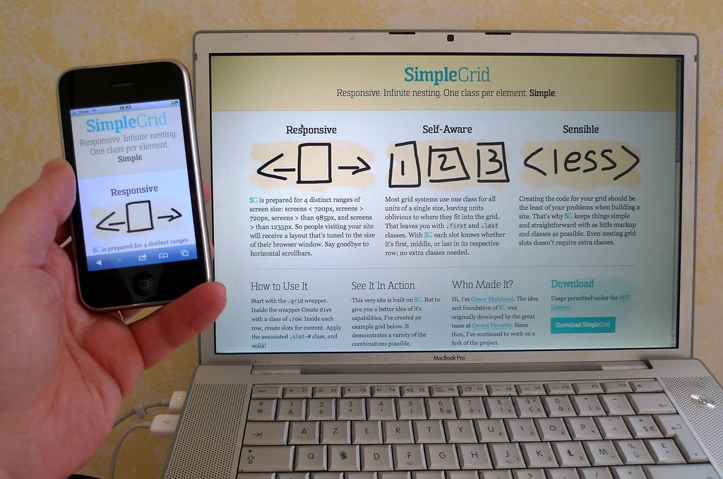
WordPress mobile optimization is not optional
WordPress mobile optimization matters because many visitors first meet your business on a phone. If text is cramped, buttons are hard to tap, or images load slowly, users may leave before they understand your offer.
Mobile work starts with the basics: readable font sizes, clear spacing, simple navigation, and fast-loading media. A page should feel intentionally designed for small screens, not squeezed down from desktop.
Check layout and content flow
Open each important page on a real phone. Look at the headline, first paragraph, menu, service sections, forms, and calls to action. The most important message should appear early, and the next step should be obvious.
Avoid long unbroken blocks of text. Use short paragraphs, useful subheadings, and lists when they help scanning. Good mobile content respects attention and reduces the effort needed to act.
Improve speed for mobile users
Mobile visitors may be on slower connections, so image weight matters. Compress photos, avoid unnecessary sliders, and test pages after adding plugins or tracking scripts. WordPress mobile optimization improves when the site sends less work to the device.
Also review forms. Keep fields minimal and labels clear. If users need to contact you, do not make them fight tiny inputs or confusing validation messages. The WordPress customization guide can help with core design settings.
Make mobile testing routine
Test before launch, after plugin updates, and after major content edits. One broken mobile section can affect a whole campaign. Screens change often, so mobile quality should be checked repeatedly.
Webocation treats WordPress mobile optimization as part of design, SEO, and conversion work. A site that works well on every screen gives every visitor a fair path forward.